How to Align Buttons Differently for Desktop and Mobile in Kadence
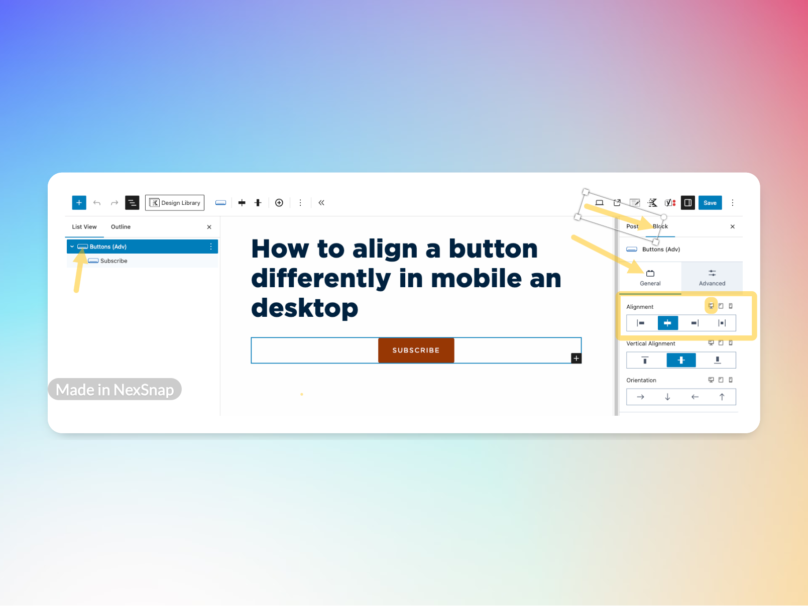
The button below will be aligned centered in desktop, but will align left if in mobile view. But how does one accomplish this? For this example, we are using the Kadence Buttons (Advanced) block.
One of the great things about the Kadence Buttons (Advanced) block is its flexibility in aligning buttons differently based on the device your visitors are using. Whether you want a button centered on mobile but left-aligned on desktop, Kadence makes it easy to adjust alignment settings right from the block settings.
In this post, I’ll walk you through how to set different button alignments for desktop and mobile using the General tab in the Kadence Buttons (Adv) block.
Adjusting Button Alignment in Kadence
Kadence Blocks allow for device-specific settings, which means you can fine-tune the user experience based on screen size. Here’s how to adjust the button alignment for different devices:
1. Add a Button Block
- In the WordPress editor, add the Kadence Buttons (Advanced) block to your page or post.
- Choose the button style and customize the text, color, and size as needed.
2. Adjust the Alignment for Desktop
- With the button selected, navigate to the General tab in the block settings.
- Find the Alignment option and choose the desired alignment (left, center, or right).
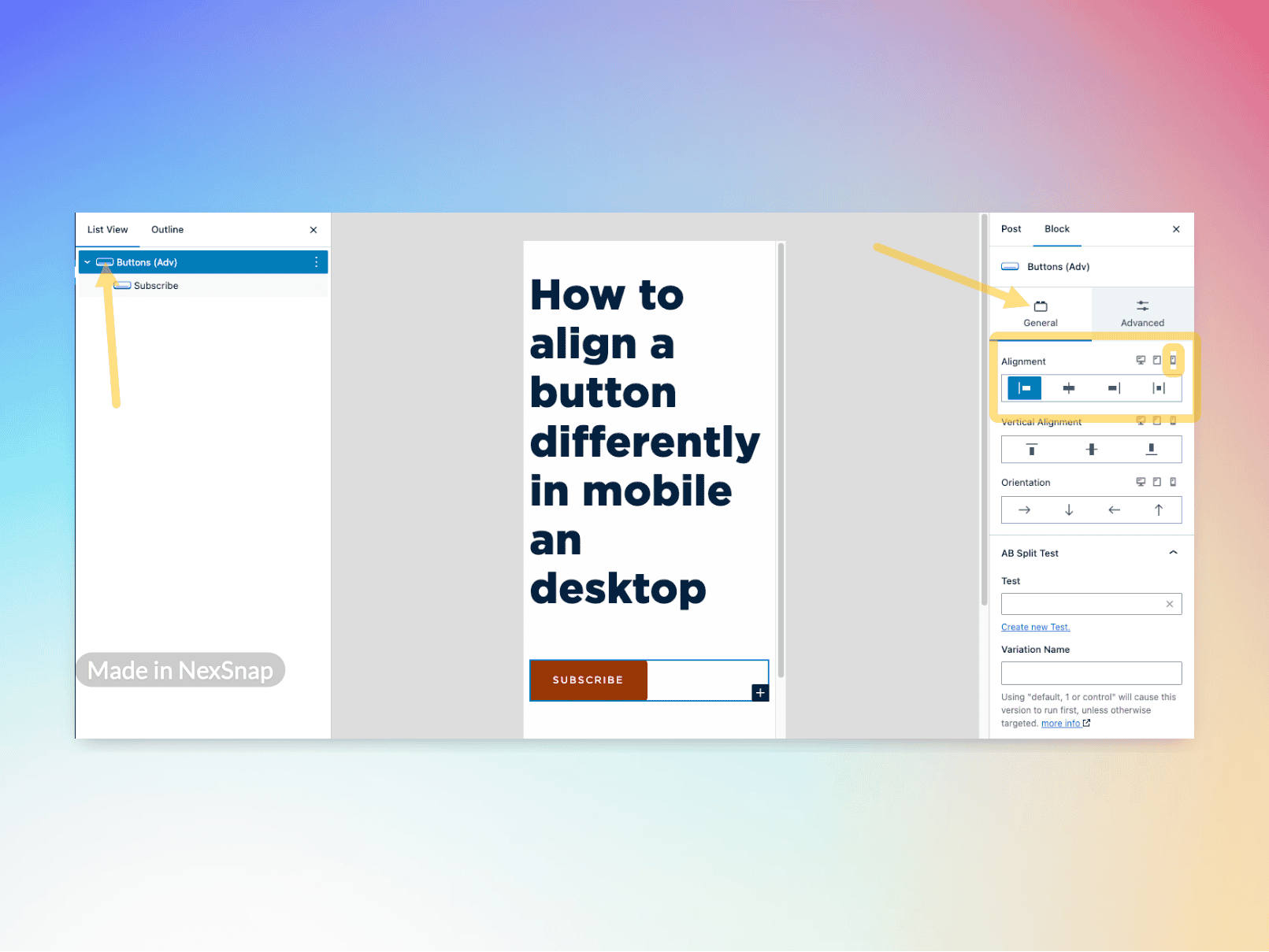
3. Adjust the Alignment for Mobile
- At the top of the block settings panel, switch to the Mobile view.
- Under the same General tab, adjust the alignment setting for mobile.
- This setting will override the desktop alignment when viewed on smaller screens.
4. Preview Your Changes
- Toggle between desktop and mobile views in the editor to ensure the alignment is applied correctly.
- Save and preview your page to see the effect in action.
Why This Feature is Helpful
- Better UX: Buttons are positioned optimally for different screen sizes.
- No Extra CSS Needed: You can adjust layouts without custom code.
- Quick Adjustments: Easily modify alignment without affecting other settings.
This simple technique ensures that your buttons always look great on any device. If you’re using Kadence Blocks for your website, take advantage of this built-in responsiveness to improve your design!