Flexbox – Modern CSS Part 1
About this Series
In this series, we will explore one component of modern web development with CSS using practical examples as they might relate to a typical WordPress website. We will focus on these techniques in practice and provide resources to really level up your understanding of the topic. This first post focuses on flexbox.
Basic Principles of Flexbox
Flexible layout, or flexbox, has been around for a while and has wide browser support. At Pixel Jar, we use flexbox to easily lay out common website components. It has wide browser support, with some quirks in some browsers. We use it on all kinds of projects, large and small.
Flexbox allows you to create dynamic layouts without knowing the explicit width of elements. You avoid many of the pitfalls of floated layouts.
Fundamentally, flexbox allows you to accomplish the following:
- Allow elements to align both horizontally and vertically
- Expand elements to fill all available space
- Shrink elements to only take up the available space
While flexbox does have widespread support, you should always test in multiple browsers to ensure consistent user experience. We really like using a tool called BrowserStack for testing browsers on real machines. There is even a popular GitHub repository dedicated to “flexbugs.”
We view flexbox as a powerful and fundamental tool for responsive web design. It works really well in a WordPress environment where you might need to work with a small component of a larger application. Flexbox shines when used for menus, laying out posts, and many other common design patterns that you might encounter on a WordPress site.
For a better understanding of the basics of flexbox, skip to the resources at the end of this post.
Flexbox in the Wild: Menus
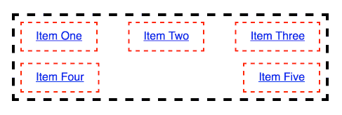
A fundamental piece of your website is the menu. It is how users navigate between pages. It is important that it is easy to read. One common design pattern is to have menu items inline with even spacing and stretch to fill the space. This can be very difficult to accomplish using techniques other than flexbox. You could end up with messy styles that will break whenever a new menu item is added.
Take this menu, with some borders added for the sake of the example:

Flexbox has a set of properties that you are able to use once you have applied the display property of “flex”. One of these properties is “justify-content”. This property describes how the elements within the parent element distribute their space. Applying “space-between” distributes the extra space between the elements. If you were to apply “space-around”, the first and last element would have extra space added on either side.

You can also add more menu items without having to change your stylesheet and adjust percentages or any other calculation.

Since one of the features of flexbox is that it shrinks elements to only fill the available space, sometimes you will see odd behavior like below:

Using another flexbox-related CSS property, you can change this default behavior. You can set “flex-wrap” to allow items to wrap when there is no more available space.
Flexbox in the Wild: Post Layout
Not only does flexbox handle space distribution horizontally, but it can also provide for vertical alignment and vertical distribution of space. Take a look at a simple listing of three blog posts.
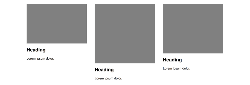
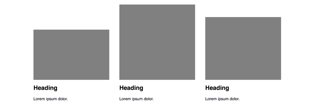
If we use one of the flexbox CSS properties called “align-items”, we can align these posts to the bottom of the container. This comes in handy when you have content with differing heights.
You can even nest flexbox and use flexbox both horizontally and vertically!
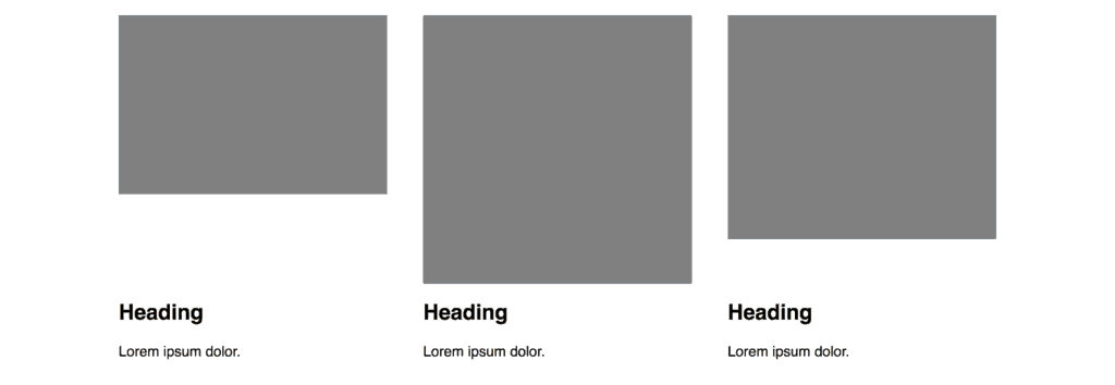
In this case, we have wrapped the text in a div, so that the image and text can use the power of flexbox for vertical alignment.
Here, we have created a flexbox layout inside of another flexbox layout. There is also a whole set of CSS properties that apply to the children of the parent flexbox container. We use the property “align-self” to fix the text to the bottom.
Closing Thoughts and Going Forward…
There are some amazing resources that can serve as a more comprehensive guide to this introduction:
CSS Tricks – One of our favorite guides (and many, many others’ favorite as well). This guide is really great as a quick visual guide for the many properties related to flexbox. This guide breaks down the properties that apply to the parent and the child elements.
MDN Web Docs – A technical overview that can help you better understand the principles of flexbox.
Flexbox Froggy – A simple game to learn flexbox in practice. You apply a different flexbox property to move frogs to their lily pads.
What The Flexbox!? – A free comprehensive course complete with real world sample cases.
If you have questions about flexbox or other CSS issues, feel free to reach out to us. We can provide development support or consultation time to solve your CSS issues.


