Improving Menu Usability with CSS
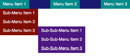
Menus are a fundamental component of a website. Users expect to be able to use a menu to navigate through your website. Menus come in many different shapes and sizes, but most follow similar patterns. There are several CSS features that can improve menu usability. Take the following menu:

This is a pretty standard pattern for a menu with multiple levels of lists. In this case, we are activating the nested menus on hover or focus, and there are three levels of lists. When building menus, a very good resource to use as a reference is the W3C Web Accessibility Initiative (WAI) guide. It is important for your menu to be usable by all, and this guide will help you to achieve this goal.
The Third-Level Menu Problem
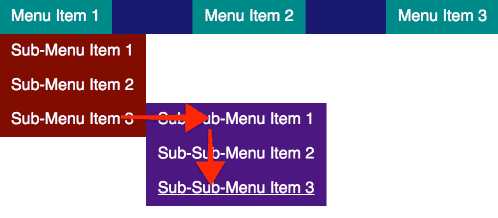
Once your menu is accessible by keyboard-only users, you might consider making some optimizations for mouse users. One unique problem with the menu above is the ability to access the third-level list using a cursor. Since this menu is a “fly-out”, getting from “Sub-Menu Item 3” to “Sub-Sub-Menu Item 3” means carefully moving the cursor to the right, and carefully moving the cursor down. This is unintuitive and potentially non-usable by users with less than 100% fine motor function. Let’s call this the third-level menu problem.

Let’s look at two ways to combat the third-level menu problem.
Method #1: Timing
Assuming that you are using a JavaScript event to listen for a mouseout event, you might add a delay to remove the sub-menu from display:
Some drawbacks here:
- You have to manage timers in your JavaScript logic by using setTimeout and clearTimeout. This is a minor inconvenience, but something that can often be better to avoid.
- There is a visual delay when your cursor leaves the element.
- You are only guessing at the optimal timing; it is imprecise and there will likely be no time which works well for all.
- You often do not have access to the menu logic, especially when working in a WordPress environment. Often, the menu markup and logic is contained within a parent theme or even a plugin.
Method #2: Pseudo-elements
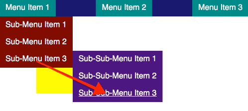
You might also be able to use a pseudo-element placed in a way to expand the cursor target area when an element is being hovered over.
Let’s refresh our understanding of the CSS pseudo-elements ::before and ::after. In the markup, these pseudo-elements select the part before and after all of the parent element’s inner content.
It looks somethings like this:
<li>
    ::before
    <a href=”#”>...</a>
    ::after
</li>
These pseudo-elements are a part of the element itself. These pseudo-elements can be positioned absolutely in relation to the parent element. This means that we can in a way “artificially” expand the mouse target of the element itself.

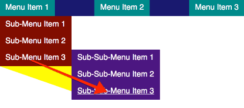
We can then level-up this styling and use the CSS property clip-path. We can use clip-path to turn our pseudo-element into a shape using some simple points. Let’s make our pseudo-element into an intuitive triangle:

Your menu allows users to navigate your site efficiently, so it is not something you want to overlook. Use this advice sparingly and cautiously, but always think about your users. If you need assistance with menu usability or other accessibility development issues, reach out to us.