Mavericks Custom Theme, Vol. 2
Two years prior we made a big, splashy statement with the first theme we developed with The Mavs. Mark Cuban wanted to set his team’s site apart from the rest of the NBA. With that mission accomplished it was time to redesign the Mavs’ site with two new goals. First was to reimagine the information architecture for quick content access. The second was to optimize the new theme for speed.

Site Speed
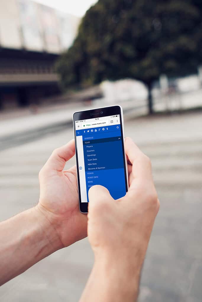
After launching the first custom theme, we had two years of analytics to review to learn how viewers were accessing the site. We found that a high percentage of users were on mobile devices with cellular connections. The challenge became how to deliver high quality imagery and video in a sub-optimum setting. We focused on reducing textures, serving appropriately sized files, streamlining the interface, and generally addressed smaller screen sizes and bandwidth needs. On top of that, we leveraged technology stack including PHP 7, varnish, and CDN.


Information Architecture
In reviewing all the analytics data we were finding that the pages many folks were looking to access were too many clicks deep for our liking. We focussed on bringing those key pages up to the surface for easy access for users while keeping the content organized in a logical and intuitive way.
Project Gallery
We collaborated with our favorite designer, Robert Nienhuis of Nien Studios. In an effort to keep the page load to a minimum we really focused on using CSS and browser capabilities to draw out as much of the design as possible. It was an absolute treat to build out these beautiful templates.

High Traffic Volume
Being a high profile NBA team, traffic to the mavs.com site is substantial, especially during draft days, game days, and playoffs. Again we worked with WP Engine to make sure both the software and the hardware delivering the site were ready to handle both heavy traffic and significant spikes in usage.
Maintaining an Existing Brand
In addition to working with an existing style guide, we were entrusted to uphold the legacy of a major sports franchise that has been a steady presence in Dallas for nearly half a century. Just ask a Mavs ManiAAC how important this team is to them and the city.

Conclusion…
The Mavericks IT team was very involved in the collaboration of every step of the development process. We asked the tough questions regarding how to make this a better website experience than before we had built before.
Because we knew this site was going to be viewed from mobile to cinema, responsiveness was one of our key watchwords throughout the development process. At every iteration we were testing this theme on every device we could get our hands on.
The resulting theme is something that really delivered on the established goals and had us all quite proud.
Ready To Get Started?
We look forward to hearing what challenges you are bringing to us.
Tell Us About Your Project
Ready to get started? Fill out the short form below and let us know a bit more about what you have in mind. We’re excited to hear what you’re working on.
Back in 2013, we partnered with the talented team at Pixel Jar to make Mavs.com the first fully-responsive team website across the NBA. Brandon, Jeff and Robert have been keeping us in front of the cutting edge ever since.